
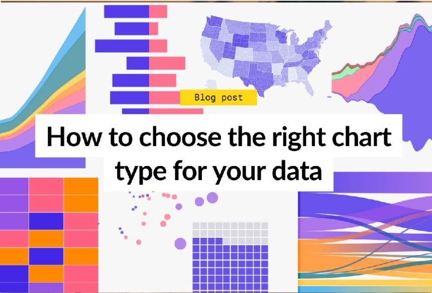
When it comes to presenting data, choosing the right chart template can make all the difference. Have you ever tried to decipher a complicated chart, only to find yourself lost in a maze of colors and overlapping visuals?
The effectiveness of your message largely hinges on how well your data type is matched with an appropriate visual representation. Selecting an engaging chart template not only clarifies your data but also strengthens the overall impact of your presentation.
Let’s explore to know more.
Understand Your Data Type
The first step in selecting the right chart template is to identify the data type you are working with. Are you dealing with categorical, time-series, or continuous data?
Bar charts are best for comparing categories side by side, while line charts are ideal for illustrating patterns or progressions across a timeline.
Consider Your Audience
Different people interpret information in different ways, so the chart you use should match their level of understanding and interest. For example, if you’re presenting to a general audience with little technical background, it’s best to use simple charts like bar graphs or pie charts that are easy to read at a glance. On the other hand, if you’re speaking to data analysts or professionals, more complex visuals like scatter plots or multi-line graphs may be appropriate.
Think about what your audience needs to learn from your data. Are they looking for trends, comparisons, or big-picture insights?
The chart you choose should make it easy for them to get that information quickly. A well-chosen chart not only helps your audience understand the data better, but also keeps them more engaged and focused throughout your presentation.
Keep Your Message Clear
Your chart should emphasize the key message or insight you wish to convey. Before settling on a template, determine what you want your audience to take away from the data.
Are you highlighting a pattern, a unique insight, or a significant comparison? By ensuring your template enhances your core message, you can avoid overwhelming your audience with unnecessary details or embellishments.
Explore Different Chart Types
To choose the right chart template for your data, it’s important to explore different chart types and understand what each one is best used for. Not all data sets are the same, and using the wrong chart can make your information confusing or unclear. For example, bar charts are great for comparing categories, while line charts are ideal for showing trends over time.
Pie charts work well for displaying parts of a whole, but they can be hard to read if there are too many sections. Exploring different templates helps you match the right visual to your message.
Many online tools offer a variety of chart types with customizable templates, making it easier to experiment and find what fits best. By trying out different options, you can make sure your data is presented clearly, accurately, and in a way that keeps your audience engaged. Choosing the right chart boosts both understanding and impact.
Leverage Color Wisely
Color can be a powerful tool in chart design, enhancing readability and visual impact. However, using it wisely is crucial. Stick to a consistent color scheme that aligns with your brand or the subject matter.
Make sure there’s sufficient contrast between different data series so that your audience can quickly distinguish between them. In addition, be cautious of color-blindness considerations; use patterns or textures in conjunction with colors for better accessibility.
Utilize White Space
White space, or the empty space around your chart elements, helps keep your design clean, organized, and easy to read. When a chart is too crowded with text, colors, or data points, it can overwhelm the viewer and make it harder to understand the message. Using a chart template that balances content with white space allows key information to stand out.
Good use of white space guides the viewer’s eyes and improves focus. It separates different sections of data and makes labels, legends, and headings more noticeable.
When choosing a chart template, look for layouts that don’t cram in too much detail and instead give your visuals room to “breathe.” A simple, well-spaced design can be more effective than a busy one, helping your audience grasp the meaning of your data quickly and clearly.
Incorporate Interactive Elements
In the digital age, interactive charts can engage users more effectively than static images. If your data type allows, consider using interactive elements where viewers can hover or click to get more information.
This approach can facilitate deeper engagement and understanding, especially with complex data sets. Tools like Adobe Express’ chart creator to stand out from the crowd provide options for creating interactive charts.
Test Different Templates
Don’t be afraid to experiment with different chart templates. What works for one dataset may not necessarily work for another.
Create multiple versions of your chart and gauge which template resonates best with your audience. Seeking feedback from peers can offer valuable insights and help you refine your choices further to ensure maximum impact.
Keep it Simple
A clear, straightforward chart makes it easier for your audience to understand the message you’re trying to share. When charts are too complex-with too many colors, lines, or labels-they can confuse viewers and distract from the key points. Simplicity ensures that your data speaks for itself without unnecessary design elements getting in the way.
Start by picking a chart type that matches your goal. For example, use a bar chart to compare values, a line chart to show trends over time, or a pie chart to display parts of a whole. Then, limit the use of extra features like 3D effects, cluttered legends, or bright colors. A clean, simple chart is not only easier to read but also more professional. By focusing on clarity, you help your audience quickly grasp your data and stay engaged.
Choose the Right Chart Template by Matching Your Data Type
Selecting the right chart template is not just about visual appeal; it’s about functionality and clarity. By understanding your data type and considering your audience’s needs, you can create impactful and easily digestible charts.
Remember to leverage color judiciously, utilize white space effectively, and keep your charts interactive, wherever possible. Following these strategies will guide you in making thoughtful choices that enhance your data’s narrative and elevate your presentations.
Looking for more tips and advice? You’re in the right place! Make sure to bookmark our page and come back to check out more interesting articles.
For More Information Visit Timelymagazine


